The City of Boston's icon set
With the new Boston.gov, we stepped up our game. You’ll find close to 300 custom icons across the site, including on department pages and on our homepage. Even with these tiny icons, we made sure to stick to our strategic principles. We want to look warm but official, creating an environment that makes you want to click around and explore our site.
Through icons, we’re able to communicate meaning across languages. Along with helping you navigate the site, our icons also add a bit of personality to Boston.gov.
EXPERIENTIAL ICONS
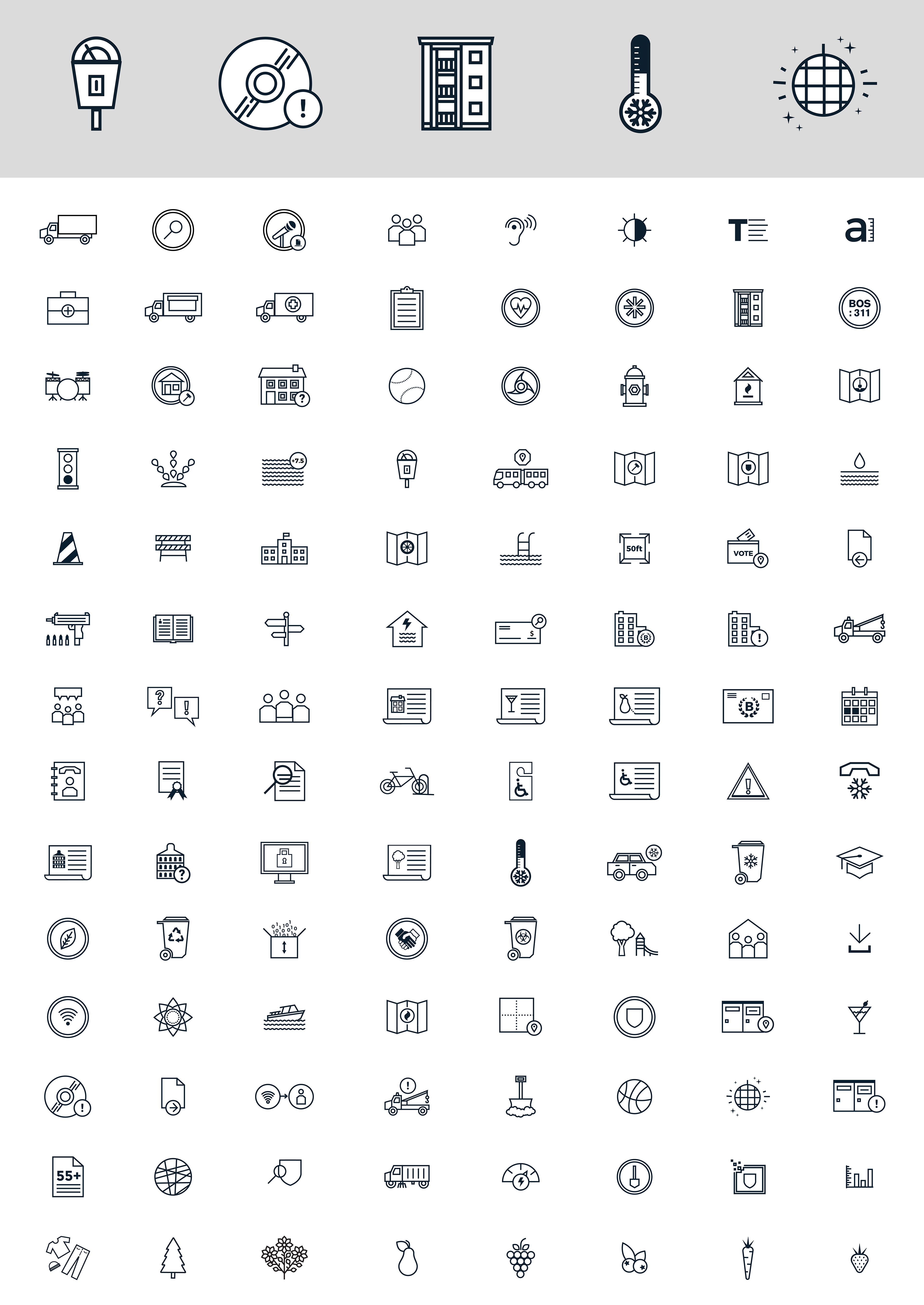
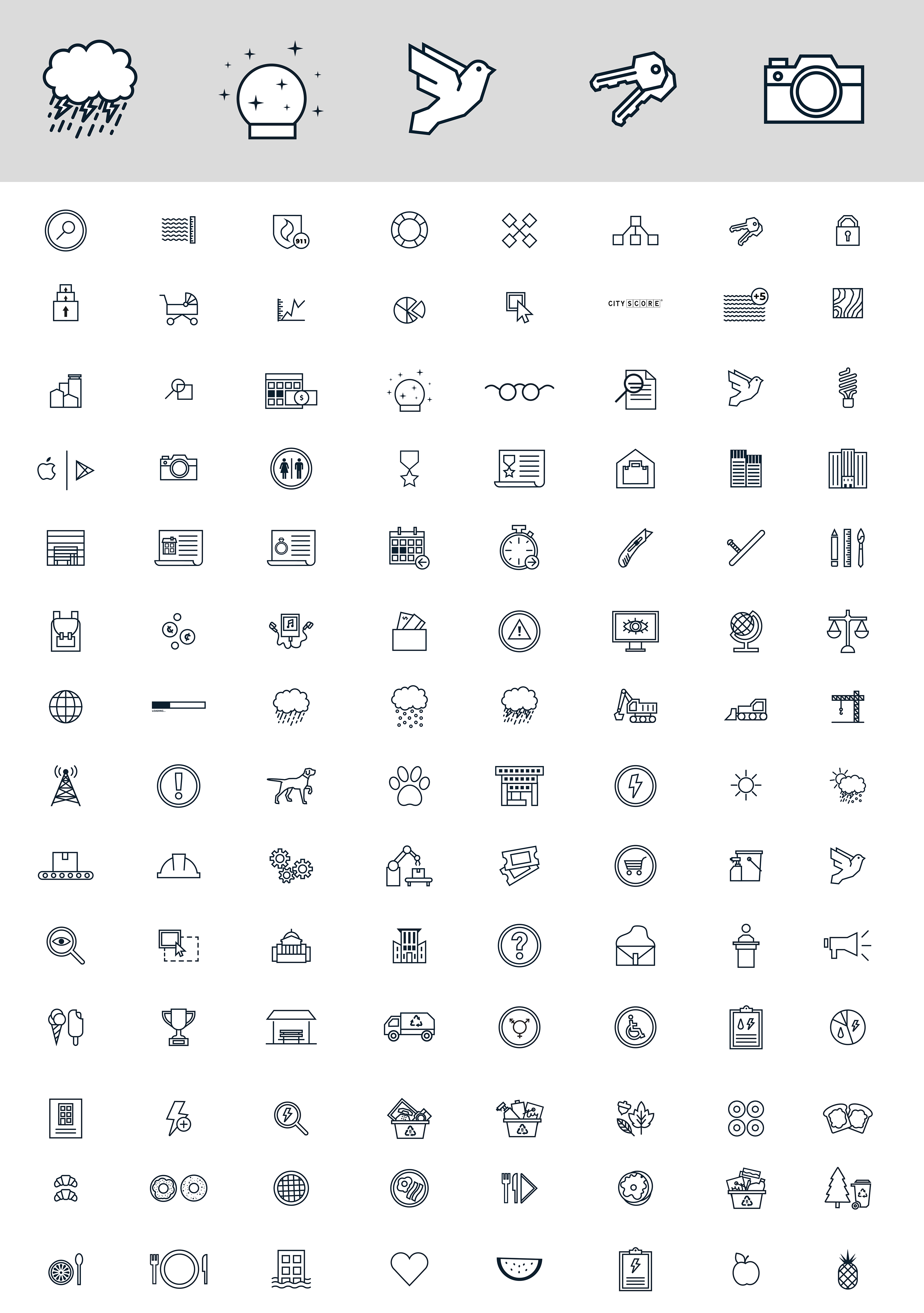
One of the main types of icons you’ll run across on Boston.gov are “experiential” icons. These bold line icons are used for specific actions a citizen may want to take, like paying a parking ticket or registering
to vote. Experiential icons also give us a chance to add a little humor and a personal touch to our work. They are built using three-pixel width strokes and usually (but not always) have hard edges.


DEPARTMENT ICONS
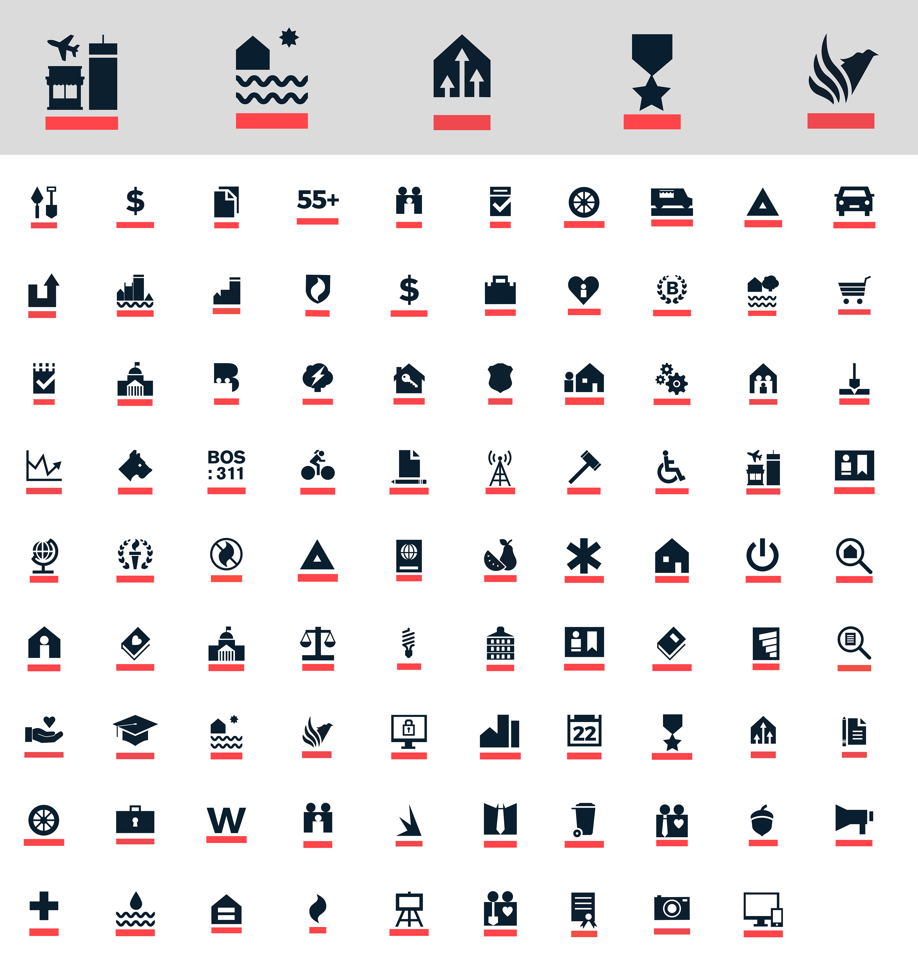
As part of the rebranding of Boston.gov, we gave departments their own icons for the site. You can see each of these “departmental” icons on our department directory. These icons are meant to indicate deeper content, or may just point you to a specific department page. They are in no way meant to replace current departmental marks and logos. They are a wayfinding tool for people to see which department created a piece of content on Boston.gov.
These icons are simpler and made of solid shapes so that they can easily be recognized by a repeat user. They are filled with Charles River Blue and given a bold underline with Freedom Trail Red. Wondering just what “Freedom Trail Red” and “Charles River Blue” mean? Learn more about our colors.
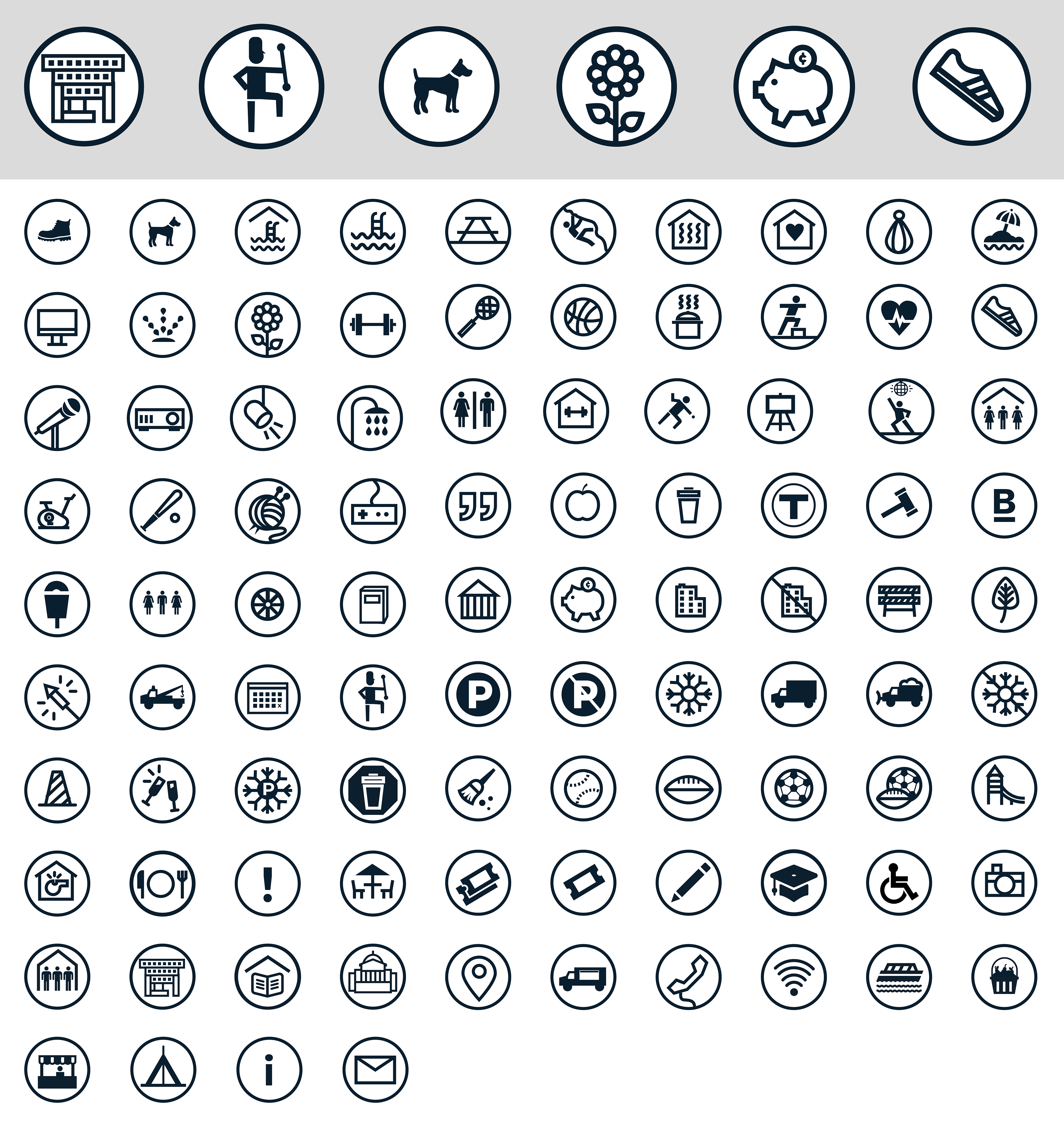
SMALL CIRCULAR ICONS
You’ll also find small, circular icons on our place profiles, but really, they can be used wherever they're needed. For these inline icons, we are using a similar style to our social media icons. They are surrounded by a three pixel circle and filled with Charles River Blue. They’re used to describe the features of a place. You can see great examples of inline icons in the sidebars of the Boston Centers for Youth & Family community center pages (scroll a bit down the page).
Icons might not seem like a big deal, but they are an easy aspect of a site to get wrong. We plan to
grow and expand our icons over time as we add new content and topics to the site. By using icons
with a similar look and feel, we hope to cut out the confusion, and surprise and delight you with our
style decisions.