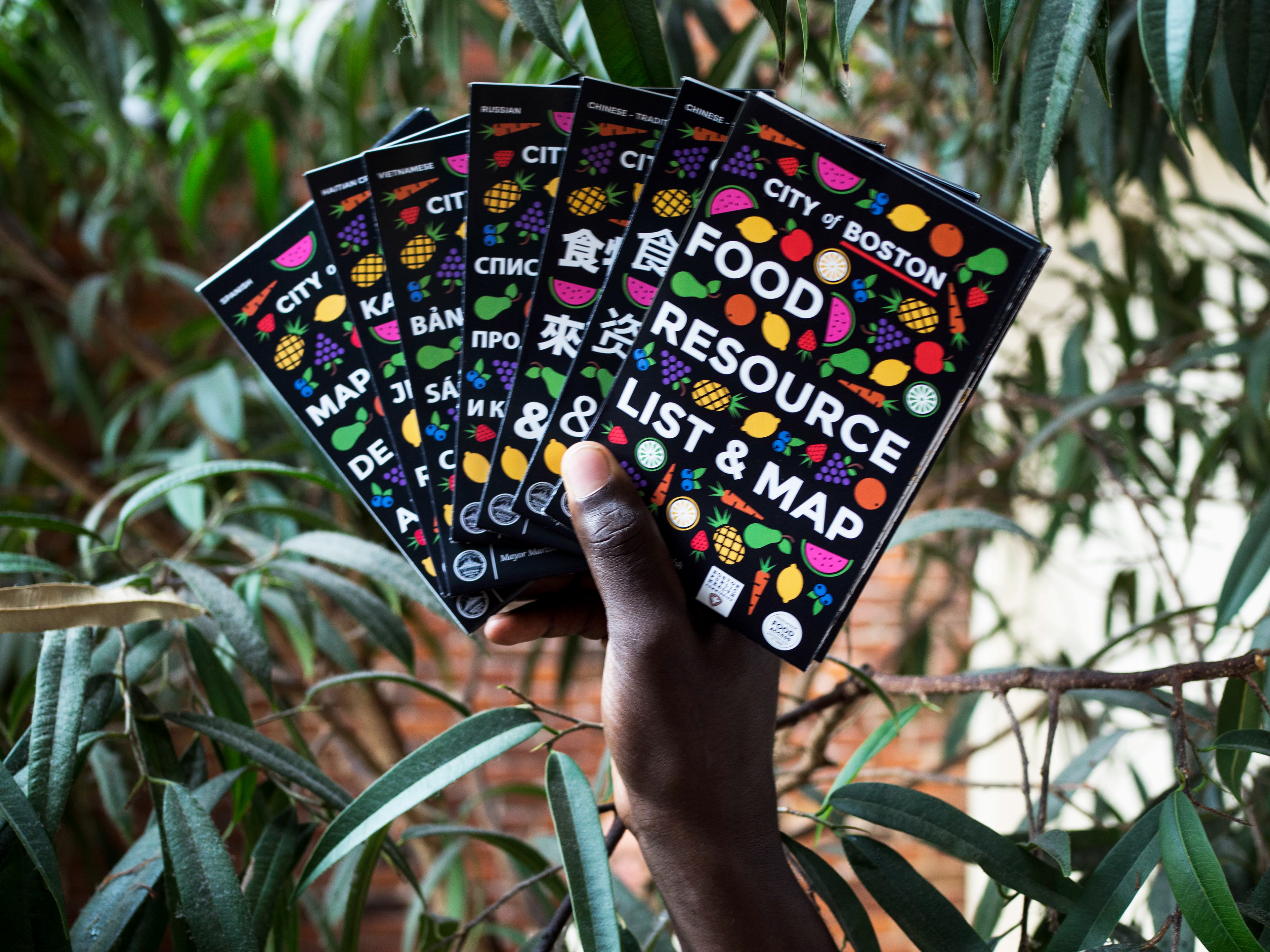
In May 2017, the Office of Food Access and the Boston Public Health Commission approached us with a project idea. They wanted to create a map for people struggling to find and pay for food in the City. The map would show different locations around the City where someone who needs food help could get it. Another important feature? The map had to be foldable so that it could be easily carried and fit in someone's pocket.
The Greater Boston Food Bank, using Feeding America data, found that one in six Bostonians are food insecure. That means their diet lacks variety and quality. These residents may also have trouble finding food, and may be eating less food than is recommended for a normal diet. Those type of statistics keep many of us up at night, so we jumped at the chance to help the Office of Food Access.
The Food Access team settled on five languages:
Spanish | Haitian Creole | Vietnamese | Russian, and | Chinese (both simplified and traditional).
These were the most common languages spoken by residents struggling to find the food they need and want. The Boston Planning & Development Agency also helped in this process. They looked at common languages spoken in high areas of need in the City, as well as poverty rates.
We outsourced our translations to a third party company. But, translations can be tricky. The Food Access team found that we needed to clean up some of the text to make things clearer. Thankfully, staff members from the Offices of Immigrant Advancement and Food Access, as well as the Boston Public Health Commission, stepped up and saved the day. Instead of worrying about the words, we just had to worry about the overall look and feel of our list and map.
Since we were showing locations, we had to make the map big enough for our locations to be legible. We solved this problem by rotating the map from its normal axis. By using this technique, we were able to accurately depict the City’s layout at the size we wanted, all while keeping the locations readable.
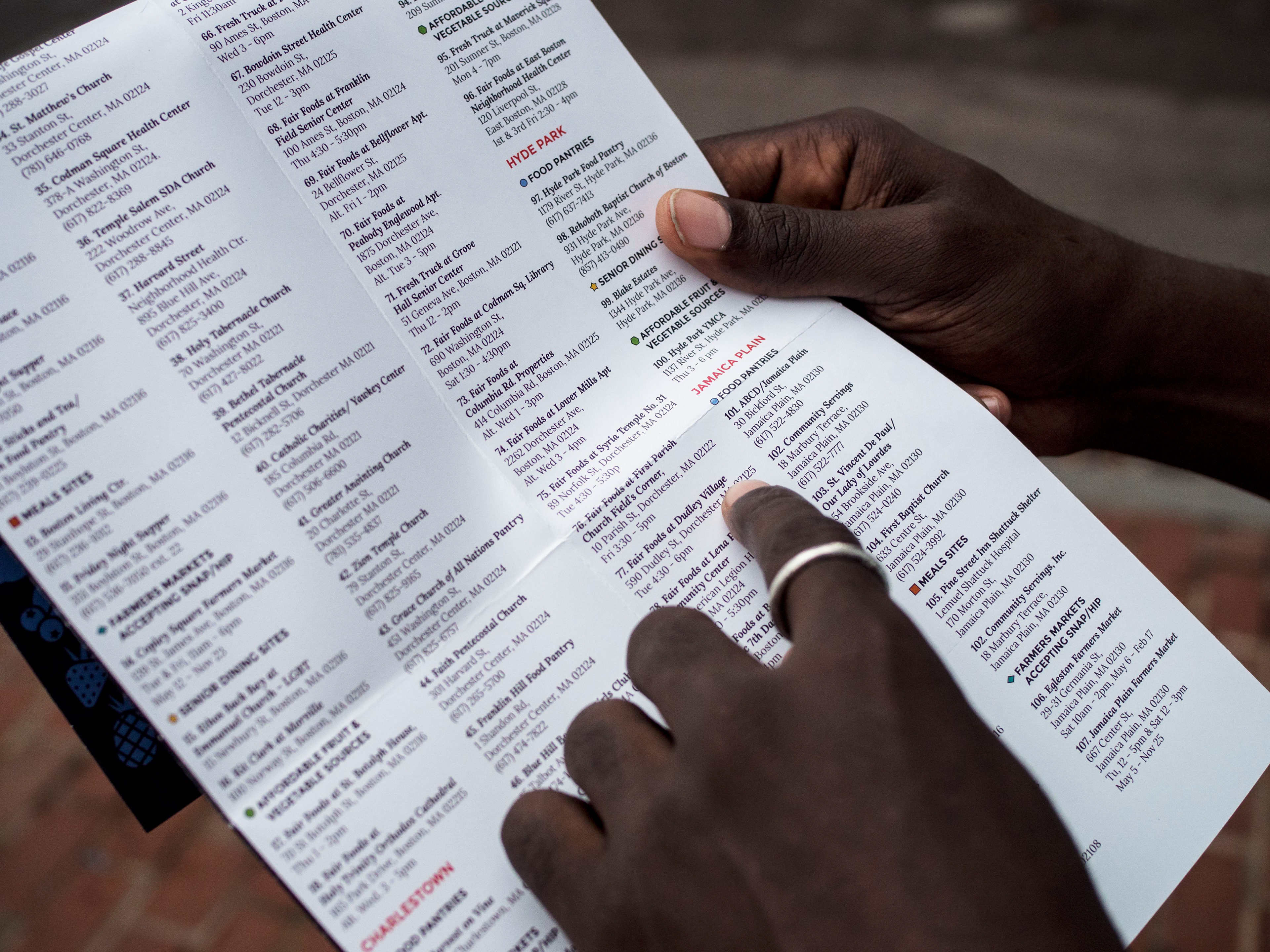
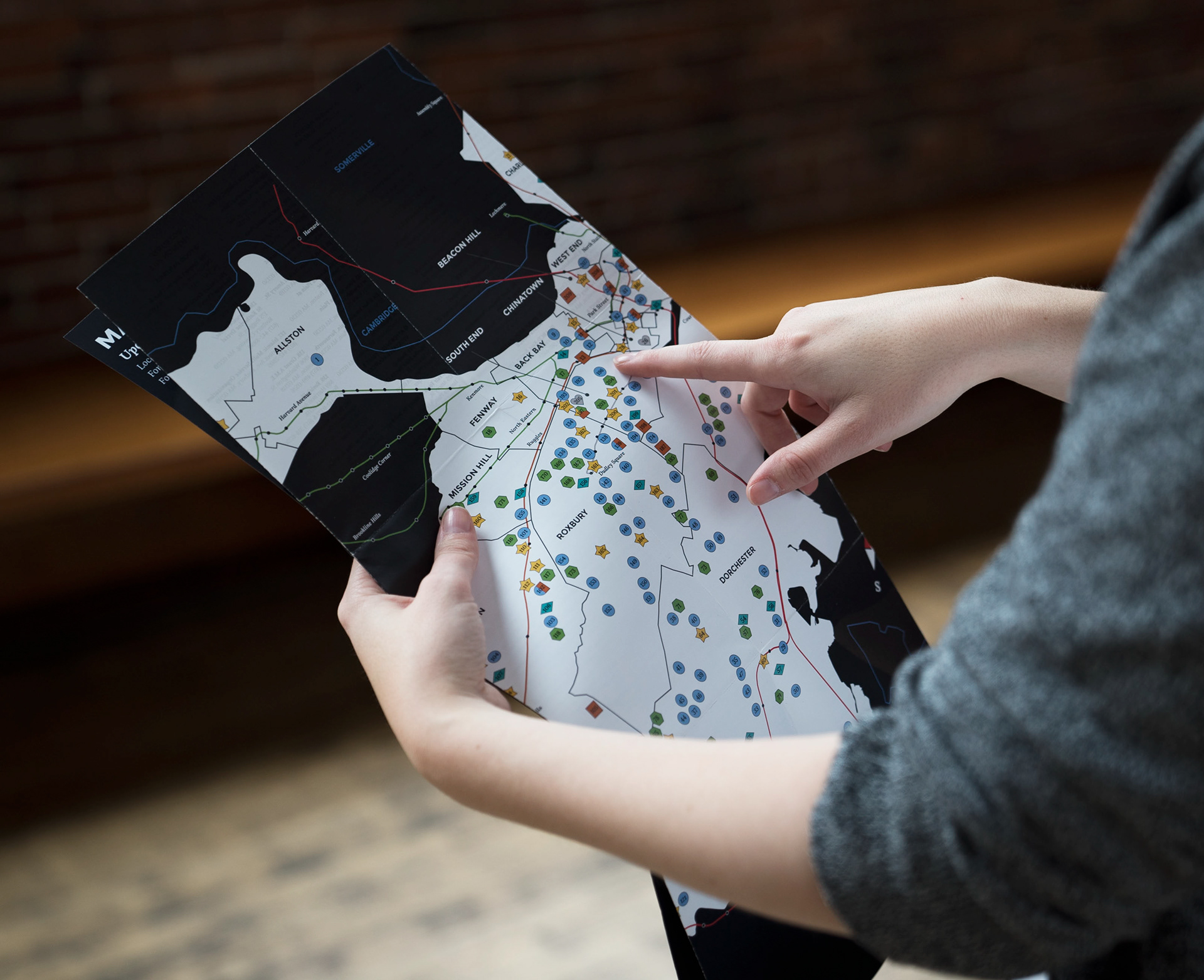
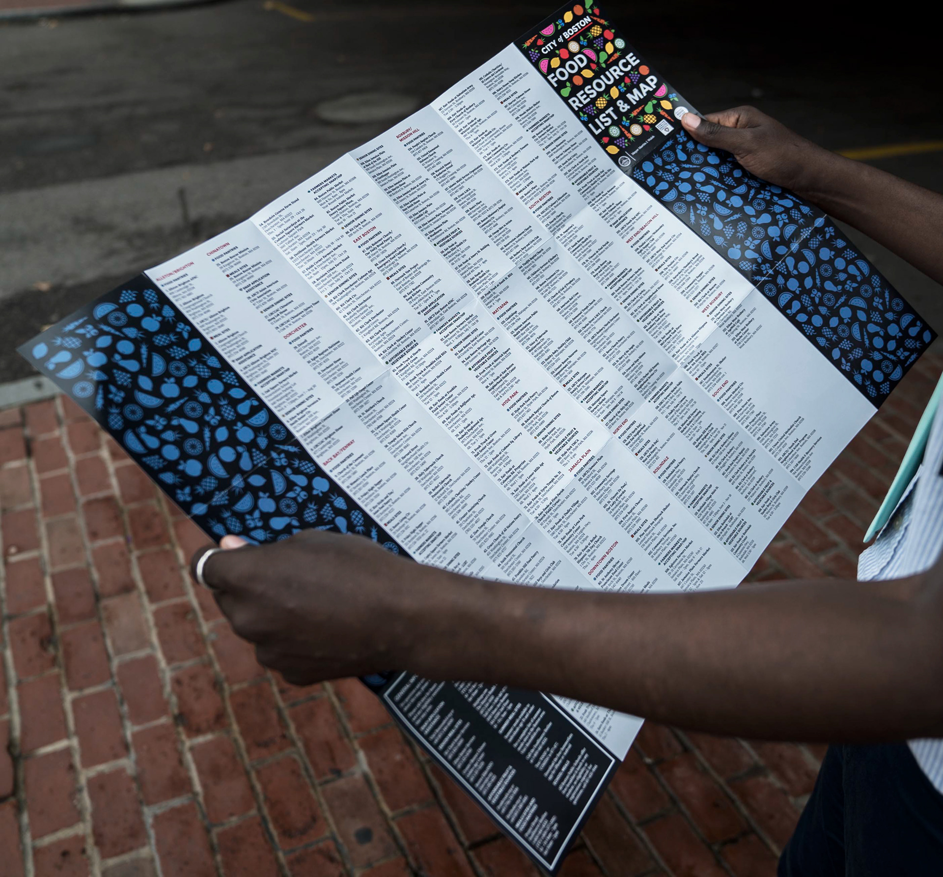
For ADA we created categories for the locations on our map. Then, we assigned specific shapes and colors for each category. That way, even if someone has color blindness, they would still be able to distinguish the different locations based on those shapes. We also assigned a number to each location. These numbers can be used to reference our full list of locations on the back of our map.
